A John Snow approach to Business
We live in the Data Era.
There are more data sources than we can deal with, and sometimes the relations between different sources are tough to grasp.
Maps have always served us very well for data relation tasks: they make data understandable and, most of all, they allows us to see relations between events and phenomenas that would go unnoticed in other analytical supports.
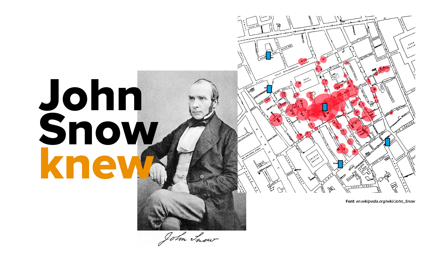
One of the best examples of the power of maps to understand cause/effect relations and create information from apparently non related data is the cholera map created by John Snow. This a story that echoes in different scientific areas and proves the universality of maps: they add context and visual understating in practically any theme.

Source: C.F. Cheffins, Lith, Southhampton Buildings, London, England, 1854 in Snow, John. On the Mode of Communication of Cholera, 2nd Ed, John Churchill, New Burlington Street, London, England, 1855.
The story can be told shortly: London 1854. Difficult times for London population, specially in Soho, when a cholera outbreak killed hundreds. A map saved the city. How?
By mapping the deaths in a street map and adding the location of water wells, John Snow found out the relation between a contaminated water source and cholera. It was an instant insight, driven from spatially organized data, prepared to be seen in a map.
It’s a case to say that John Snow knew the power of maps. Your business can also take advantage of a “John Snow” moment: look at your data in a map, combine it with external sources and enable your users to interact with it in a simple way.